1 + 1[1] 2R visualisations and Markdown tables in Quarto
Quarto enables you to weave together content and executable code into a finished document. To learn more about Quarto see https://quarto.org.
This means you can connect to your data source, conduct detailed analysis and data wrangling, produce charts and tables and present them in an output all in one go.
Outputs can be to word, PowerPoint, PDF or for the cool kids, an interactive HTML document and that is what we are going to explore here. This output creates a stand alone report with interactive elements that can be shared and emailed like any document. It can be read on any modern HTML browser and will resize and adapt to the host and so will work on tablets and phones.
It uses a combination of ‘code chunks’, some will be your basic R and some will be quarto commands and text that are then combined. The beauty of this is that you can combine the two elements which we will explore as this document goes on.
When you click the Render button a document will be generated that includes both content and the output of embedded code. You can embed code like this:
1 + 1[1] 2You can add options to executable code like this
#| echo: false
2 * 2
The echo: false option disables the printing of code so that only output is displayed, for example:
[1] 4Or you can add in chunks with code folding such as
#| code-folding: true
#| code-summary: "Show the code"
2 * 2
In this way we can set up reports that show the code and outputs or just the outputs.
Any quarto document starts with a ‘YAML’ chunk. Originally YAML was said to mean Yet Another Markup Language but has been re purposed as a recursive acronym to YAML Ain’t Markup Language. This is all geek speak but in essence the YAML is where you tell quarto the set up of your document. In it you can set the options for output, basic formatting styles and also add things like automatic tables of contents, as you can see in this document.
Most of these global options can then be tweaked within individual code blocks and so most things are customisable. You can set several output types within the YAML which will allow you to output to several formats at once, eg word and PDF if you so wish.
In this report we have the YAML
title: "R Training" \<- the title of the report\
format: \<- specify the output report\
  html: \<- state we want html\
    toc: true \<- say that we want quarto to build us a table of contents\
    toc_float: true \<- say that we want the table of contents to float so that we can access it anywhere in the document
Headings and sub headings are very useful to create your report and to navigate around it. Headings are designated by use of the ‘#’ symbol. Hierarchies of subheads can be set up by using multiple ‘#’ has symbols.
The single ‘#’ is usually reserved for the top title of the report.
Further headings are then designated with ‘##’ and sub headings are then ‘###’ and then if you want a sub sub heading ‘####’ etc. Quarto automatically keeps track of the hierarchy and will build your table of contents automatically based on your design.
Note as you scroll through the report to the sub headings, the table of contents automatically adjusts and expands and you can click on the table of contents to take you to an appropriate place. Headings don’t have to be numbered and can be set as an offset if needed. You can also set a depth for the table of contents if you wish.
This is a heading
This is the first sub heading
This is a second subheading
This is a sub heading under sub heading two
This is another heading under sub heading two
This is getting like inception now
We are back to normal subheadings as you can see that quarto takes care of numbering and will dynamically update as you create your document.
A list of further YAML options can be found at https://quarto.org/docs/reference/formats/html.html
(As you can see - links are automatically designated, or you can set up hyperlinks such as this is a hyperlink
You can do all the normal *italics* and **bold** and ^superscript^ and ~~strike-though~~> You can add block quotesAll of this can be achieved in code or on the visual editor there are options to do this in a more ‘word’ type way and quarto will convert it for you.
If you click on the visual tab in R-Studio and there are all the usual formatting options.
Bullet point lists can be set up easily
* lists
* putting stuff in lists
  + putting stuff in sub lists
  + such as this
* did I say lists?
You can also do numbered lists
(@) Like this
(@) Fine example of a list
    + and do sub lists in a numbered list
      i) and do sub sub lists
        A. and sub sub sub list
Write some stuff in the middle of your list
(@) and then go back to the list
(@) NOTE: the numbers in the list are not specified, they are dynamic and if you go and edit one out it will adjust them automaticallyQuarto also supports HTML tag formatting
<p style="font-family: comic sans MS; font-size:20pt">
    text
</p>
You can also play with HTML tags to change font to comic sans
<p style="font-family: Impact, Charcoal, sans-serif; font-size:10pt; font-style:italic">
    text
</p>
Just because you can does not mean you should!
And add coloured blocks
<style>
div.blue { background-color:#e6f0ff; border-radius: 5px; padding: 20px;}
</style>
<div class = "blue">
</div>
You can colour in a block to assist with highlighting an area.
Quarto also allows you to use some nice call out blocks
::: {.callout-note}
Note that there are five types of call outs, including:
`note`, `warning`, `important`, `tip`, and `caution`.
:::
Note that there are five types of call outs, including: note, warning, important, tip, and caution.
This is an example of a call out with a caption.
Warning - these call outs look seriously cool.
This is an example of a ‘folded’ caution call out that can be expanded by the user. You can use collapse="true" to collapse it by default or collapse="false" to make a collapsible call out that is expanded by default.
If you want you can turn the icon off with “.call out-caution collapse=”true” icon=‘false’” to simply have a collapsible box.
You can insert an image or logo!

Or animated gifs

These may not work in certain environments.
I take no responsibility for you inserting animated cats into your reports
As you can probably see in some of the code above, I have used ‘:::’ to create some formatting. This allows us to adjust the formatting between those spans. Above I have used call outs but you can also use this to set the page to be wider than the default.
For instance
:::{.column-page}
:::
This allows you to put in a wider column of text or a wider chart or table than you probably otherwise would. I am going to ramble on a bit here so you can see just how amazing wide this little section can be. Blimey it is pretty wide isn’t it?
You can then revert back to normal and then if you want…
:::{.column-screen}
:::
You can go really super wide and take up the whole of the screen, this is super useful if you have a really big table or plot or map or something and you really want to use every inch of the screen. Woo! Look at how wide this this! It literally goes from all the way over there to all the way other there. I know right?
We will come back to formatting later and will show how to put charts and tables and stuff into columns. But now we are going to load in some data and make some plots and start looking at actually adding some data stuff and widgets.
We are now going to load in the NHS-R data sets so we have some stuff to play with and the tidyverse so we can do some wrangling and plots.
Details on the NHS-R dataset can be found here https://github.com/nhs-r-community/NHSRdatasets
Details on the Tidyverse can be found here https://www.tidyverse.org/
We now want to switch from quarto markdown language and go more into traditional R. I am going to keep code echo on so that code appears in this document so you can see what is going on.
Use the three back ticks and then r in curly brackets to designate that we are now writing R code. We wouldn’t normally show this, but will for this training.
# check if relevant libraries are installed
# install them if not
# then call the library

# **NOTE** hash tags have turned back into commenting within the R chunk

if(!require(NHSRdatasets)){
    install.packages("NHSRdatasets",dependencies =TRUE )
    library(NHSRdatasets)}
Loading required package: NHSRdatasetsif(!require(tidyverse)){
install.packages("tidyverse", dependencies =TRUE)
library(tidyverse)}Loading required package: tidyverse── Attaching packages ─────────────────────────────────────── tidyverse 1.3.2 ──
✔ ggplot2 3.4.1 ✔ purrr 1.0.1
✔ tibble 3.1.8 ✔ dplyr 1.1.0
✔ tidyr 1.3.0 ✔ stringr 1.5.0
✔ readr 2.1.3 ✔ forcats 0.5.2
── Conflicts ────────────────────────────────────────── tidyverse_conflicts() ──
✖ dplyr::filter() masks stats::filter()
✖ dplyr::lag() masks stats::lag()## pull some data from the NHS R data set
data <- ae_attendancesWe can create a plot in R as we normally would and it will render inline in the report. For example.
# a simple plot
plot <- ggplot(
  filter(data, org_code == "RXQ"),
  aes(
    x = period,
    y = attendances,
    group = type,
    colour = type
  )
) +
  geom_line(linewidth = 1) +
  labs(title = "RXQ Number of attendances by type") +
  theme_minimal()

plot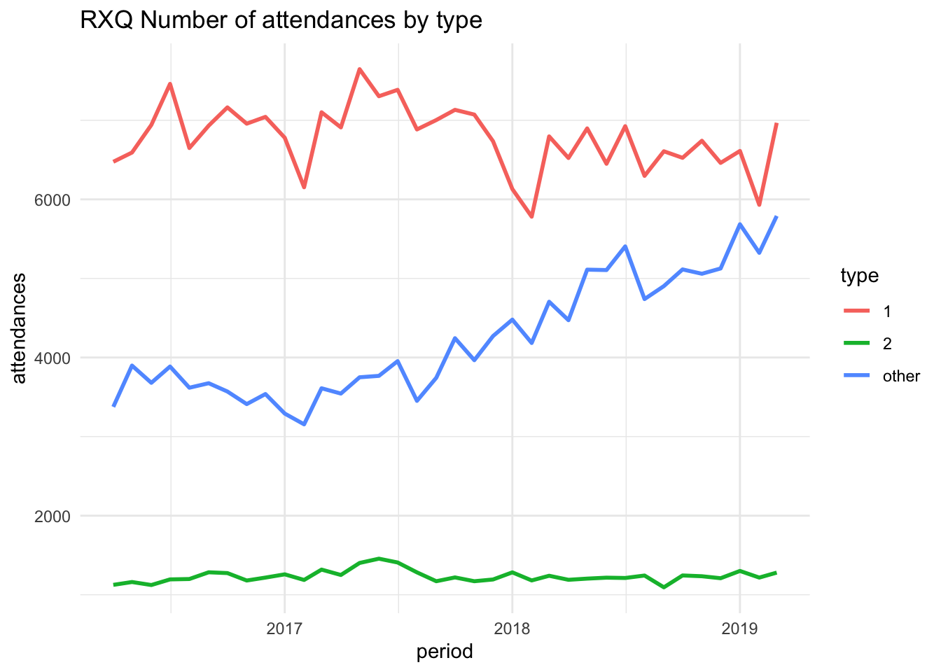
Or we can show a basic tibble output for a table
data |> filter(org_code == "RF4",
                type == "other",
                attendances >= 5000)
# A tibble: 9 × 6
period org_code type attendances breaches admissions
<date> <fct> <fct> <dbl> <dbl> <dbl>
1 2019-03-01 RF4 other 10289 90 0
2 2019-02-01 RF4 other 9643 87 0
3 2019-01-01 RF4 other 10424 77 0
4 2018-12-01 RF4 other 9460 95 0
5 2018-11-01 RF4 other 8264 30 0
6 2018-10-01 RF4 other 7900 14 0
7 2018-09-01 RF4 other 7604 39 0
8 2018-08-01 RF4 other 7184 73 0
9 2018-07-01 RF4 other 5072 10 0We can set up plots and text side by side with more advanced spans
:::: {.columns}
::: {.column width="60%"}
col 1
:::
::: {.column width="40%"}
col 2
:::
This is some text along side the chart that is over to the left. You can specify any number of columns and assign them a percentage of the screen width. Quarto will then resize objects to fit. I also put a bit of blank space between them. You could also use this section to add another plot to have them side by side.
This is all achieved with the colon formatting.
We could also put two SPC charts next to one another with text underneath each one so we have a rows and column format.
if(!require(NHSRplotthedots)){
install.packages("NHSRplotthedots",dependencies =TRUE )
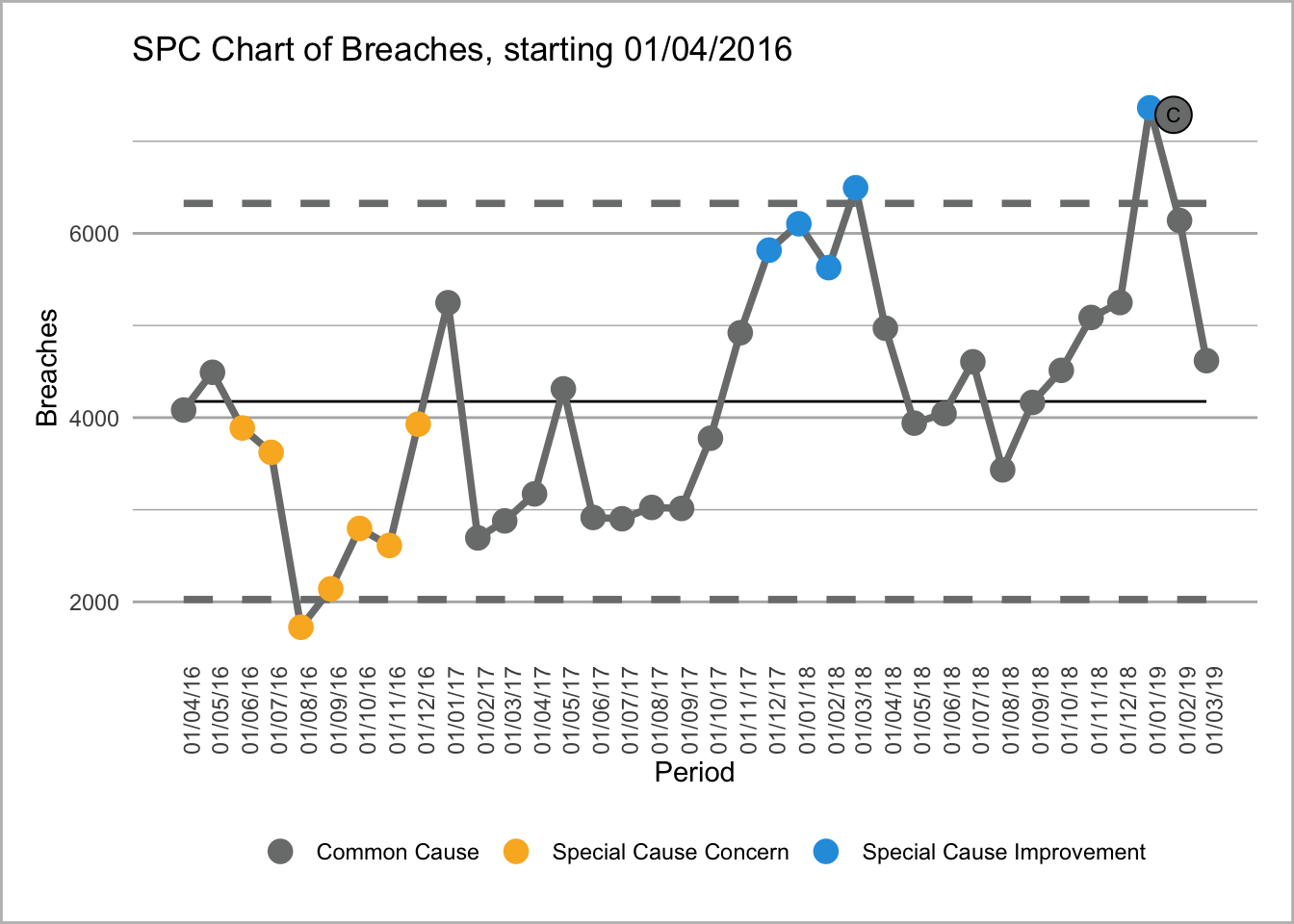
library(NHSRplotthedots)}Loading required package: NHSRplotthedots# filter data to type 1 for a single site
data_spc <- data|>
filter(org_code == "RF4",
type == 1)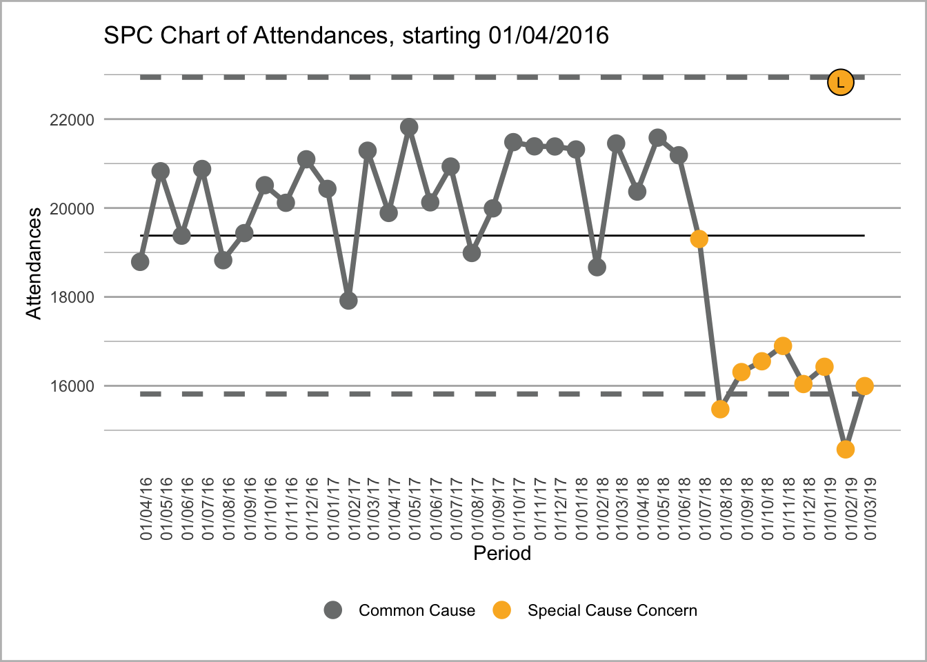
Text for first chart where see can attendances going into special cause blah blah blah.
Text for second chart where see can breaches where we can see breaches going all wibbly wobbly. Pretty sure that is a SPC term - reminder to check)
This uses the amazing NHS-R community plot the dots package that replicates NHS SPC rules https://github.com/nhs-r-community/NHSRplotthedots. It allows you create SPC charts with ease and creates a GG plot object that you can then format or tweak to your desire.
It is also possible to bring R code into your text. This is really nice if you want to automate some commentary.
This means that you can dynamically add numbers or words and phrases to your report.
All you need to do is use back tick r and then a another back ick to finish your r.
So if I put in 22 April 2023, this would return todays date. Look at the code to see it in action.
Just to show that today’s date is 22 April 2023, this will be the date the report it run. Once reports are run they are stand alone and so dates like this are not automatically updated.
if(!require(english)){
    install.packages("english",
                     dependencies =TRUE )
    library(english)}
Loading required package: english# create a message depending on when this report is run.
message <-
case_when (
weekdays(Sys.Date()) == "Monday" ~ "its the start of the week, oh well keep going",
weekdays(Sys.Date()) == "Tuesday" ~ "its Tuesday which isn't Monday, oh well keep going",
weekdays(Sys.Date()) == "Wednesday" ~ "its hump day, the middle of week, oh well keep going",
weekdays(Sys.Date()) == "Thursday" ~ "its Friday eve, oh well keep going",
weekdays(Sys.Date()) == "Friday" ~ "its Friday, just gotta get through this til the weekend",
TRUE ~ "its the weekend dude"
)This means you can adjust your report to the data, for instance you are running this report on a Saturday which means its the weekend dude.
You can also pull data from data frames such as the highest amount of attendances using 32,209, in our dataset that was 32,209. The format function is really nice at making human readable numbers or you can get R to convert numbers to text using thirty-two thousand two hundred nine to say the highest was thirty-two thousand two hundred nine attendances. There are also options to add appropriate indefinite articles before numeric words and convert numbers into ordinals such as ‘first’, ‘third’ etc.
Details on the English library can be found here https://cran.r-project.org/web/packages/english/english.pdf
Another really cool thing you can go with Quarto spans is make tab sets. This allows you to enable the user to click between different charts or a chart and a table.
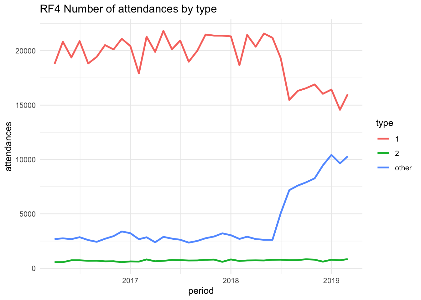
Just going to make another plot quickly, the same as before but for a different provider.
plot_RF4 <- ggplot(
  filter(data, org_code == "RF4"),
  aes(
    x = period,
    y = attendances,
    group = type,
    colour = type
  )
) +
  geom_line(linewidth = 1) +
  labs(title = "RF4 Number of attendances by type") +
  theme_minimal()
We can now render these in separate tabs using,
::: {.panel-tabset}
## tab 1

## tab 2
For example,
Tab content showing plot for RQX

Tab content showing different content for provider RF4
Tab sets are a great way to make quite static reports that little more interactive. People love to click buttons and gets then interested in the report and who knows, maybe the data?
There are a few options you can add to tabsets including .tabset-pills .tabset-fade to change tabs into buttons and a a smooth fade transition.
I have shown a very basic tibble output but it is pretty ugly. There are a number of table packages and they have all manner of strengths and weaknesses, depending on what you are trying to do. I will give a few examples and try to highlight what they are good for.
Kable is a nice package that makes pretty simple static tables. It works across all formats but does not have advanced interactive features and does not allow you to add icons or graphs into your tables.
Lets make some data for a table.
data_for_table <- data |>
  filter(org_code=="RF4",
         type == "other",
         attendances >= 5000)
We can then make this into a pretty table.
if(!require(kableExtra)){
    install.packages("kableExtra",
                     dependencies =TRUE)
    library(kableExtra)}
Loading required package: kableExtra
Attaching package: 'kableExtra'The following object is masked from 'package:dplyr':
group_rowskable(data_for_table)| period | org_code | type | attendances | breaches | admissions |
|---|---|---|---|---|---|
| 2019-03-01 | RF4 | other | 10289 | 90 | 0 |
| 2019-02-01 | RF4 | other | 9643 | 87 | 0 |
| 2019-01-01 | RF4 | other | 10424 | 77 | 0 |
| 2018-12-01 | RF4 | other | 9460 | 95 | 0 |
| 2018-11-01 | RF4 | other | 8264 | 30 | 0 |
| 2018-10-01 | RF4 | other | 7900 | 14 | 0 |
| 2018-09-01 | RF4 | other | 7604 | 39 | 0 |
| 2018-08-01 | RF4 | other | 7184 | 73 | 0 |
| 2018-07-01 | RF4 | other | 5072 | 10 | 0 |
And we can add a few more lines to make this a little more pretty and responsive.
You could even parse variables or conditionals into the formatting to replicate conditional formatting.
kable(data_for_table) |>
   kable_styling("striped") |>
  pack_rows("sub heading and indent first 3 rows",
            1,
            3) |>
  row_spec(4,
           bold = T,
           background = "yellow") |>
  row_spec(7,
           bold = T,
           color = "white",
background = "#D7261E")| period | org_code | type | attendances | breaches | admissions |
|---|---|---|---|---|---|
| sub heading and indent first 3 rows | |||||
| 2019-03-01 | RF4 | other | 10289 | 90 | 0 |
| 2019-02-01 | RF4 | other | 9643 | 87 | 0 |
| 2019-01-01 | RF4 | other | 10424 | 77 | 0 |
| 2018-12-01 | RF4 | other | 9460 | 95 | 0 |
| 2018-11-01 | RF4 | other | 8264 | 30 | 0 |
| 2018-10-01 | RF4 | other | 7900 | 14 | 0 |
| 2018-09-01 | RF4 | other | 7604 | 39 | 0 |
| 2018-08-01 | RF4 | other | 7184 | 73 | 0 |
| 2018-07-01 | RF4 | other | 5072 | 10 | 0 |
Further details on kable can be found here https://cran.r-project.org/web/packages/kableExtra/vignettes/awesome_table_in_html.html
GT uses similar syntax to GGplot to build tables in a similar fashion. It can output to most formats but not directly to PowerPoint. You can save the table as an image and insert that as a workaround.
GT does have the power to insert icons and mini graphs into the table.
if(!require(gt)){
    install.packages("gt",
                     dependencies =TRUE)
    library(gt)}
Loading required package: gtif(!require(gtExtras)){
install.packages("gtExtras",
dependencies =TRUE)
library(gtExtras)}Loading required package: gtExtrasgt(data_for_table) |>
gt_plt_bar(column = attendances,
keep_column = TRUE,
width = 35)| period | org_code | type | attendances | breaches | admissions | attendances |
|---|---|---|---|---|---|---|
| 2019-03-01 | RF4 | other | 10289 | 90 | 0 | |
| 2019-02-01 | RF4 | other | 9643 | 87 | 0 | |
| 2019-01-01 | RF4 | other | 10424 | 77 | 0 | |
| 2018-12-01 | RF4 | other | 9460 | 95 | 0 | |
| 2018-11-01 | RF4 | other | 8264 | 30 | 0 | |
| 2018-10-01 | RF4 | other | 7900 | 14 | 0 | |
| 2018-09-01 | RF4 | other | 7604 | 39 | 0 | |
| 2018-08-01 | RF4 | other | 7184 | 73 | 0 | |
| 2018-07-01 | RF4 | other | 5072 | 10 | 0 |
There are all manner of mini charts you can add and also you add add other icons such as plot the dots SPC icons or whatever you want, check out fontawesome for icons.
There are also options to add row and column totals or averages.
Now we are getting into the realms of interactive tables. This is more where you have a data table that you wish to allow the user to search, filter and sort.
This type of table only works in HTML outputs.
Will create another subset of data to put into the table.
if(!require(DT)){
    install.packages("DT",
                     dependencies =TRUE)
    library(DT)}
Loading required package: DT# pick a random sample of 150 rows from the data
data_for_dt <- data[sample(nrow(data),
size=150), ]
datatable(data_for_dt,
filter = 'top',
extensions = 'Buttons',
options = list(dom = 'Blfrtip',
buttons = c('copy',
'csv',
'pdf',
'print'),
lengthMenu = list(c(10,25,50,-1),
c(10,25,50,"All"))))This lovely table gives us some nice widgets and features to play with. You can click on a column heading to sort by that column, click it again to reverse the sort. You can click in the filter boxes and select filters. You can opt to expand the data. You can type in the search box to find or filter the data and then finally you can export the data or print it. This will export or print based on your sorts and filters.
Further info on the DT library can be found here https://rstudio.github.io/DT/
Now if you want to group your data and show hierarchy and calculations, flextable is great.
Again this is HTML only.
if(!require(reactable)){
    install.packages("reactable",
                     dependencies =TRUE)
    library(reactable)}
Loading required package: reactabledata_for_reactable <- data |>
filter (period > '2018-10-01')
reactable(
data_for_reactable,
groupBy = c("period",
"type"),
minRows = 10,
columns = list (
attendances = colDef(
aggregate = "median",
name = "Median attendances",
align = "left"
),
breaches = colDef(
aggregate = "max",
name = "Max breaches",
align = "left"
) ,
admissions = colDef(
aggregate = "mean",
format = colFormat(digits = 1),
name = "Mean admissions",
align = "left"
)
)
)With this table you can drill down into the data. The aggregation has been completed by the table and no calculations have been carried out externally to the table. This is a nice way to create a hierarchy of systems/icbs/providers/directorates/teams/workers.
Further details for reactable can be found here https://glin.github.io/reactable/
A few well known other table libraries are Flextable Huxtable or tableone if you want a more research based table one.
Flextable is very similar to GT in outputs. It does feature some additional output types. However I find the syntax of GT easier to work with.
Plotly is a fantastic alternative plotting library. It is fantastic for creating interactive plots really simply. These work in HTML outputs. The simplest way to use plotly is to build a plot in ggplot and then convert it to a plotly plot. So lets do that. We can take the ‘plot’ object we have previously created and convert it.
Plotly has all manner of options and futher details can be found https://plotly.com/r/
if(!require(plotly)){
    install.packages("plotly",
                     dependencies =TRUE)
    library(plotly)}
Loading required package: plotly
Attaching package: 'plotly'The following object is masked from 'package:ggplot2':
last_plotThe following object is masked from 'package:stats':
filterThe following object is masked from 'package:graphics':
layoutp <- ggplotly(plot,
source = 'h',)
pAt first glance this gives us a very similar plot. However we now have hover over on the plot traces. You can click on the legend and turn lines on and off. You can click and rag an area and zoom into that section. You can also save a picture of your filtered plot. Have a play with the icons above the plot and see what you can do.
We will filter down type one attendances and compare number of attendances.
data_for_boxplot <- data |>
  filter (type == 1)

plot_ly(data_for_boxplot,
        x = ~org_code,
        y = ~attendances,
        source = 'f',
        type = "box")
This is a nice example of where zoom becomes useful. You can also see how plotly has added some additional information that we have not calculated to show quartile values and you can hover over outliers to identify them.
This is an area that comes under the just because you can, doesn’t mean you should. Animated graphs can be used to show an additional dimension over time.
Lets have a look at our original graph and animate it. This does require a little more wrangling to generate a accumulated data frame.
if(!require(lazyeval)){
    install.packages("lazyeval",
                     dependencies =TRUE)
    library(lazyeval)}
Loading required package: lazyeval
Attaching package: 'lazyeval'The following objects are masked from 'package:purrr':
is_atomic, is_formulaif(!require(lubridate)){
install.packages("lubridate",
dependencies =TRUE)
library(lubridate)}Loading required package: lubridateLoading required package: timechange
Attaching package: 'lubridate'The following objects are masked from 'package:base':
date, intersect, setdiff, union# little function that creates a accumulated data frame
accumulate_by <- function(dat,
var) {
var <- lazyeval::f_eval(var,
dat)
lvls <- plotly:::getLevels(var)
dats <- lapply(seq_along(lvls),
function(x) {
cbind(dat[var %in% lvls[seq(1, x)], ],
frame = lvls[[x]])
})
dplyr::bind_rows(dats)
}
# filters data and orders it
data_ani <-data |>
filter(org_code == "RXQ") |>
arrange(period) |>
accumulate_by (~period) |>
mutate (year = year(period),
date = decimal_date(period))
# create animate plot - I have added a number of features
# so you can see how to build up this a plot
ani_plot <- data_ani |>
plot_ly(
x = ~ date,
y = ~ attendances,
split = ~ type,
frame = ~ frame,
source = 'e',
type = 'scatter',
mode = 'lines'
) |> layout(
xaxis = list(title = "Date",
zeroline = F),
yaxis = list(title = "Admissions",
zeroline = T)
) |> animation_opts(frame = 100,
transition = 0,
redraw = TRUE) |>
animation_slider(hide = F) |>
animation_button(x = 1,
xanchor = "right",
y = 0,
yanchor = "bottom")
ani_plotThis uses lazyeval https://github.com/hadley/lazyeval and lubridate https://lubridate.tidyverse.org/
Another one to be in the realms of just because you can doesn’t mean you should is the 3D plot.
Here we can see a 3d scatter plot of Attendances, Discharges and Breaches. This uses plotly.
data_three_d <- data |>
  filter (org_code == 'RF4',
          type == 1)

plot_ly(data_three_d,
        x = ~breaches,
        y = ~attendances,
        z = ~admissions,
        type = 'scatter3d',
        source = 'd',
        mode = 'markers')
Well that certainly is a thing. You can click and drag to rotate and also use mouse wheel to zoom in and out.
NOTE Whilst we are here, have you noticed that the table of contents to the lesft has now expanded to show all the subheadings in this plot section?
Another great plotting library that is more specifically designed for interactive time series is DY graphs. This has some great features that we will explore below. It does require a bit more of unusual data type but it is simple to convert.
if(!require(dygraphs)){
    install.packages("dygraphs",
                     dependencies =TRUE)
    library(dygraphs)}
Loading required package: dygraphsif(!require(xts)){
install.packages("xts",
dependencies =TRUE)
library(xts)}Loading required package: xtsLoading required package: zoo
Attaching package: 'zoo'The following objects are masked from 'package:base':
as.Date, as.Date.numeric
Attaching package: 'xts'The following objects are masked from 'package:dplyr':
first, lastdata_for_dy <- data|>
filter (org_code == 'RF4',
type == 1) |>
select(period,
attendances)
# create a 'xts' time series object
dy_xts <- xts(x = data_for_dy$attendances,
order.by = data_for_dy$period)
dygraph(dy_xts,
main = "Admissions over time") |>
dyOptions(labelsUTC = TRUE,
fillGraph=TRUE,
fillAlpha=0.1,
drawGrid = FALSE,
colors="#D8AE5A",) |>
dyRangeSelector() |>
dyCrosshair(direction = "vertical") |>
dyHighlight(highlightCircleSize = 5,
highlightSeriesBackgroundAlpha = 0.2,
hideOnMouseOut = FALSE) |>
dyRoller(rollPeriod = 0) |>
dyAxis("y", label = "Number of admissions")This gives us a nice graph with a slider to filter the time series, this allows focus on specific areas. There is also the little box on the bottom left that takes a numeric input, if you add a number in there, then it automatically smooths the time series to a rolling average of a window of what you specify.
More info on dygraphs can be found here https://rstudio.github.io/dygraphs/index.html
A nice plot to visualise a survey is a likert plot. You can wrap this into a ggplotly if you want hover overs and such like, but, I think this doesn’t really need to be interactive.
if(!require(data.table)){
    install.packages("data.table",
                     dependencies =TRUE)
    library(data.table)}
Loading required package: data.table
Attaching package: 'data.table'The following objects are masked from 'package:xts':
first, lastThe following objects are masked from 'package:lubridate':
hour, isoweek, mday, minute, month, quarter, second, wday, week,
yday, yearThe following objects are masked from 'package:dplyr':
between, first, lastThe following object is masked from 'package:purrr':
transposeif(!require(likert)){
install.packages("likert",
dependencies =TRUE)
library(likert)}Loading required package: likertLoading required package: xtable
Attaching package: 'likert'The following object is masked from 'package:dplyr':
recode#create some ‘random’ dummy data (deliberately skewed for demo purposes)
d <- setDT(data.frame(
do_you_like_puppies = sample(1:4,50,replace = TRUE),
do_you_like_kittens = sample(2:5,50,replace = TRUE),
do_you_like_excel = sample(1:3,50,replace = TRUE),
do_you_like_pirana = sample(1:5,50,replace = TRUE),
do_you_like_guppies = sample(1:3,50,replace = TRUE),
do_you_like_quarto = sample(4:5,50,replace = TRUE),
do_you_like_grungs = sample(1:5,50,replace = TRUE)
))
# convert the data into text and assign function 'levels'
# ie the order of the factors
data_l <- d |>
mutate_all(
(~factor(case_when(
. == 1 ~ "Strongly disagree",
. == 2 ~ "Disagree",
. == 3 ~ "Neutral",
. == 4 ~ "Agree",
. == 5 ~ "Strongly agree"),
levels = c("Strongly disagree",
"Disagree",
"Neutral",
"Agree",
"Strongly agree")
)))
# plot the data into a likert chart
plot(likert::likert(data_l),
low.color = "#FF6665",
high.color = "#5AB4AC",
neutral.color.ramp = "white",
neutral.color = "grey90")+
ggtitle("Attitudes towards stuff")+
theme_classic(base_size = 12)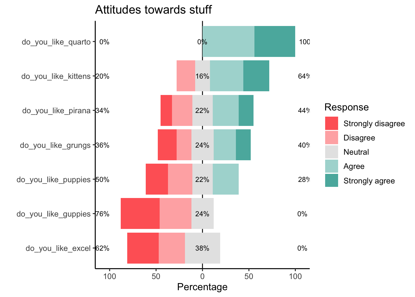
This used data.table to pull the data together. It is a completely alternative methodology for using dataframes. It is faster and has many great features. Way too much to go through in this tutorial. More info here https://rdatatable.gitlab.io/data.table/
It also uses a likert library, details here https://github.com/jbryer/likert
We know pie charts are terrible, but sometimes you need a visual representation of proportions. Treemaps gives a nice alternative and also can do this in an interactive way to show proportions within sub groups.
This uses plotly once more.
# data for treemap - compare attendances by two sites and type of attendance
 data_treemap <- data |>
   filter (org_code %in% c('RF4',
                           'R1H')) |>
  group_by(org_code,type) |>
  summarise(tot_admits = sum(attendances)) |>
  ungroup()
`summarise()` has grouped output by 'org_code'. You can override using the
`.groups` argument.#Since your treemap is "many" dimensional, you'll need a unique ID field for each row. I'm not sure what dimension size constitutes this necessity by Plotly standards. The easiest way is to use the child and parent names.
#This column needs to be the first column in the data frame. (I have NO idea why.)
data_treemap <- data_treemap |> # create id labels for each row
mutate(ids = ifelse(org_code == "",
type,
paste0(type,
"-",
org_code))) |>
select(ids,
everything())
# You also have to add the parents to items with the total for the parent. In the parent columns, you'll enter empty strings (because the parent doesn't have a parent).
par_info <- data_treemap |>
group_by(org_code) |> # group by parent
summarise(tot_admits = sum(tot_admits)) |> # parent total
rename(type = org_code) |> # parent labels for the item field
mutate(org_code = "",
ids = type) |> # add missing fields for data_treemap
select(names(data_treemap)) # put cols in same order as data_treemap
# Now smash your original data with the content in par_info,
# and you are hot to plot.
data_treemap <- rbind(data_treemap,
par_info)
plot_ly(
data = data_treemap,
branchvalues = "total",
type = "treemap",
labels = ~type,
parents = ~org_code,
values = ~tot_admits,
ids = ~ids)A dendogram is a really nice way of showing flow through systems. Our data set here is not really a good example but hopefully you get the point. You can make these horizontal or vertical and play with all manner of bits within the nodes.
if(!require(collapsibleTree)){
    install.packages("collapsibleTree",
                     dependencies =TRUE)
    library(collapsibleTree)}
Loading required package: collapsibleTreedata_collapse <- data |>
filter (org_code %in% c("RK9",
"RWJ",
"AD913")) |>
group_by (org_code, type) |>
summarise (tot_attend = sum(attendances),
tot_breach = sum(breaches),
tot_admit = sum(admissions)) |>
pivot_longer(cols = c(tot_attend,
tot_breach,
tot_admit))`summarise()` has grouped output by 'org_code'. You can override using the
`.groups` argument.collapsibleTree( data_collapse,
c("org_code",
"type",
"name"),
nodeSize = 'count',
root = 'Base data',
tooltip = TRUE,
attribute = 'value')You can click on the nodes and expand the network. In this instance you can click on the sites and it then shows a breakdown of types of attendances and then a click another node to expand that. You can drag and click and zoom in and out with mouse wheel.
Further details https://github.com/AdeelK93/collapsibleTree
The iheatmapr package specializes in creating interactive heat maps, that range from standard heat maps to relatively complex ones, that can be built up in stages. It uses the plotly for interactivity.
This is getting pretty advanced now but shows a little of the art of the possible.
Going to load in a historic measles data set to show this one off. A good potential if you want to show the impact of an intervention.
This library appears to have a conflict with plotly - you currently cant render both within a document in its native form. There is an option to convert it into a pure plotly plot.
if(!require(iheatmapr)){
    install.packages("iheatmapr")
    library(iheatmapr)}
Loading required package: iheatmaprdata(measles, package = "iheatmapr")
hm <- main_heatmap(measles, name = "Measles<br>Cases", x_categorical = FALSE,
layout = list(font = list(size = 8, width = '100%'))) |>
add_col_groups(ifelse(1930:2001 < 1961,"No","Yes"),
side = "bottom", name = "Vaccine<br>Introduced?",
title = "Vaccine?",
colors = c("lightgray","blue")) |>
add_col_labels(ticktext = seq(1930,2000,10),font = list(size = 8)) |>
add_row_labels(size = 0.3,font = list(size = 6)) |>
add_col_summary(layout = list(title = "Average<br>across<br>states"),
yname = "summary") |>
add_col_title("Measles Cases from 1930 to 2001", side= "top") |>
add_row_summary(groups = TRUE,
type = "bar",
layout = list(title = "Average<br>per<br>year",
font = list(size = 8)))
# this library has conflicts with plotly so this
# converts it into plotly to solve that conflict
hm <- to_plotly_list(hm)
plotly_build(hm)Again this really benefits from plotlys ability to zoom in and out. The iheatmap library gives lots of helper functions to build this type of plot. You could do it with just plotly, but I like things to be easy.
More details on iheatmapr at https://docs.ropensci.org/iheatmapr/
You can also create a data set and create filters within plotly, for example if we take our original plot and get data for two (or more) sites, we can create a drop down box to switch between the two sites.
data_plot_drop <- data |>
  filter(org_code %in% c("RF4",
                         "R1H",
                         "RJ6"),
         type == 1) |>
  arrange(period)

pd <- data_plot_drop |>
  plot_ly(
    type='scatter',
    mode = 'lines',
    x = ~period,
    y = ~attendances,
    source = 'c',
    transforms = list(
      list(
        type = 'filter',
        target = ~org_code,
        operation = '=',
        value = unique(data_plot_drop$org_code)[1]
      )
  )) |> layout(
    updatemenus = list(
      list(
        type = 'dropdown',
        active = 0,
        buttons = list(
          list(method = "restyle",
               args = list("transforms[0].value",
                           unique(data_plot_drop$org_code)[1]),
               label = unique(data_plot_drop$org_code)[1]),
          list(method = "restyle",
               args = list("transforms[0].value",
                           unique(data_plot_drop$org_code)[2]),
               label = unique(data_plot_drop$org_code)[2]),
          list(method = "restyle",
               args = list("transforms[0].value",
                           unique(data_plot_drop$org_code)[3]),
               label = unique(data_plot_drop$org_code)[3])
        )
      )
    )
  )

pd
This method is a little more difficult to set up and takes a little more wrangling to make it work dynamically based on your data set, but it does provide some excellent functionality.
You can also use this method to change the chart type or other attributes within a chart. This may be useful to switch between say a box plot and scatter plot on the same data.
R has a fantastic library called leaflet that allows you to create maps with many layers. These can be pointers, drill downs or choropleth (heat maps). Shape files of LSOAs are available open source. These can then be coloured in based on any factor you choose.
Another really useful thing to be able to do is add pointers onto a map. Often your data comes in form of postcode and there is a nice geocoder available that converts UK postcodes into longitudes and latitudes.
An example map.
if(!require(leaflet)){
    install.packages("leaflet",
                     dependencies =TRUE)
    library(leaflet)}
Loading required package: leaflet
Attaching package: 'leaflet'The following object is masked from 'package:xts':
addLegendif(!require(tidygeocoder)){
install.packages("tidygeocoder",
dependencies =TRUE)
library(tidygeocoder)}Loading required package: tidygeocoder## creates a basic data frame with some teams and postcodes
label <- c('Team A',
'Team A',
'Team B',
'Team B',
'Team C')
postcode <- c('EX16 7FL',
'EX39 5EN',
'PL13 2WP',
'PL15 8RZ',
'PL30 4PX')
df <- data.frame(label,
postcode)
## This is the magic bit that uses the tidygeocoder package to find longitudes and latitudes
df <- df |>
mutate(geo(address = df$postcode,
method = 'osm'))Passing 5 addresses to the Nominatim single address geocoderQuery completed in: 5 seconds## Filters cohort into three lists, one for each icon set
cohort_filter1 <- df |>
filter(df$label == "Team A")
cohort_filter2 <- df |>
filter(df$label == "Team B")
cohort_filter3 <- df |>
filter(df$label == "Team C")
## Create awesome icon sets for colours
iconSet <- awesomeIconList(
"Team A" = makeAwesomeIcon( icon = 'male',
lib = 'fa',
iconColor = "black",
markerColor = "red",
spin = FALSE ) ,
"Team B" = makeAwesomeIcon( icon = 'male',
lib = 'fa',
iconColor = "black",
markerColor = "orange",
spin = FALSE ) ,
"Team C" = makeAwesomeIcon( icon = 'male',
lib = 'fa',
iconColor = "black",
markerColor = "beige" ,
spin = TRUE ) )
## Creates layers for map, each for the three icon set 'Teams'
map <- leaflet(df) |>
addTiles() |>
addProviderTiles(providers$OpenStreetMap) |>
addAwesomeMarkers( lng = cohort_filter1$long,
lat = cohort_filter1$lat,
group = "Team A",
icon = iconSet[cohort_filter1$label],
label = paste(sep = " - ",
cohort_filter1$label ) ) |>
addAwesomeMarkers( lng = cohort_filter2$long,
lat = cohort_filter2$lat,
group = "Team B",
icon = iconSet[cohort_filter2$label],
label = paste(sep = " - ",
cohort_filter2$label ) ) |>
addAwesomeMarkers( lng = cohort_filter3$long,
lat = cohort_filter3$lat,
group = "Team C",
icon = iconSet[cohort_filter3$label],
label = paste(sep = " - ",
cohort_filter3$label ) ) |>
addLayersControl(overlayGroups = c("Team A",
"Team B",
"Team C"), ##this bit adds the controls
options = layersControlOptions(collapsed = FALSE) )
mapThe map above is built in several layers. A control has been added that allows you to switch layers on and off. You can also click and drag and zoom in and out of the map. The markers resize dynamically and keep their relative size.
More examples and details on leaflet can be found here https://rstudio.github.io/leaflet/
Wordcloud2 is the sequel to wordcloud, much like Evil Dead 2 to the original, it is a far superior product, it has some really nice easy to use features and can make all manner of different wordclouds types.
However before you get to a word cloud you need some data which is basically a list of words and their frequency. You can do this manually on your fingers or you can get R to do this for you. I definitely recommend the latter.
To get to that you read in some data, strip out all the gubbins such as punctuation, remove all the ‘stop words’ such as ‘the’ and ‘and’ etc and then remove white space and there you have a bunch of words fit for a cloud.
This is an example that pulls the text from a popular children’s novel and creates a cloud. Hopefully you can guess the book from the cloud.
You can hover over the words in the cloud and it will tell you the word and give you the number of the frequency.
if(!require(tm)){
    install.packages("tm",
                     dependencies =TRUE)
    library(tm)}
if(!require(SnowballC)){
    install.packages("SnowballC",
                     dependencies =TRUE)
    library(SnowballC)}
if(!require(wordcloud2)){
    install.packages("wordcloud2",
                     dependencies =TRUE)
    library(wordcloud2)}
if(!require(RColorBrewer)){
    install.packages("RColorBrewer",
                     dependencies =TRUE)
    library(RColorBrewer)}

## reads in text file from the interwebz
#filePath <- "https://www.gutenberg.org/files/11/11-0.txt" - not working in UDAL
text <- 'CHAPTER V. Advice from a Caterpillar The Caterpillar and Alice looked at each other for some time in silence: at last the Caterpillar took the hookah out of its mouth, and addressed her in a languid, sleepy voice. “Who are _you?_” said the Caterpillar. This was not an encouraging opening for a conversation. Alice replied, rather shyly, “I—I hardly know, sir, just at present—at least I know who I _was_ when I got up this morning, but I think I must have been changed several times since then.” “What do you mean by that?” said the Caterpillar sternly. “Explain yourself!” “I can’t explain _myself_, I’m afraid, sir,” said Alice, “because I’m not myself, you see.” “I don’t see,” said the Caterpillar. “I’m afraid I can’t put it more clearly,” Alice replied very politely, “for I can’t understand it myself to begin with; and being so many different sizes in a day is very confusing.” “It isn’t,” said the Caterpillar. “Well, perhaps you haven’t found it so yet,” said Alice; “but when you have to turn into a chrysalis—you will some day, you know—and then after that into a butterfly, I should think you’ll feel it a little queer, won’t you?” “Not a bit,” said the Caterpillar.“Well, perhaps your feelings may be different,” said Alice; “all I know is, it would feel very queer to _me_.” “You!” said the Caterpillar contemptuously. “Who are _you?_” Which brought them back again to the beginning of the conversation. Alice felt a little irritated at the Caterpillar’s making such _very_short remarks, and she drew herself up and said, very gravely, “I think, you ought to tell me who _you_ are, first.” “Why?” said the Caterpillar. Here was another puzzling question; and as Alice could not think of any good reason, and as the Caterpillar seemed to be in a _very_ unpleasant state of mind, she turned away. “Come back!” the Caterpillar called after her. “I’ve something important to say!” This sounded promising, certainly: Alice turned and came back again. “Keep your temper,” said the Caterpillar. “Is that all?” said Alice, swallowing down her anger as well as she could. “No,” said the Caterpillar.Alice thought she might as well wait, as she had nothing else to do,and perhaps after all it might tell her something worth hearing. For some minutes it puffed away without speaking, but at last it unfolded its arms, took the hookah out of its mouth again, and said, “So you think you’re changed, do you?” “I’m afraid I am, sir,” said Alice; “I can’t remember things as I used—and I don’t keep the same size for ten minutes together!” “Can’t remember _what_ things?” said the Caterpillar. “Well, I’ve tried to say “How doth the little busy bee,” but it all came different!” Alice replied in a very melancholy voice. “Repeat, “_You are old, Father William_,’” said the Caterpillar. Alice folded her hands, and began:—“You are old, Father William,” the young man said,“And your hair has become very white; And yet you incessantly stand on your head—Do you think, at your age, it is right?” “In my youth,” Father William replied to his son,“I feared it might injure the brain;But, now that I’m perfectly sure I have none, Why, I do it again and again.” “You are old,” said the youth, “as I mentioned before,And have grown most uncommonly fat;Yet you turned a back-somersault in at the door— Pray, what is the reason of that?” “In my youth,” said the sage, as he shook his grey locks, “I kept all my limbs very supple By the use of this ointment—one shilling the box—Allow me to sell you a couple?” “You are old,” said the youth, “and your jaws are too weak For anything tougher than suet; Yet you finished the goose, with the bones and the beak— Pray, how did you manage to do it?” “In my youth,” said his father, “I took to the law,And argued each case with my wife; And the muscular strength, which it gave to my jaw, Has lasted the rest of my life.” “You are old,” said the youth, “one would hardly suppose That your eye was as steady as ever;Yet you balanced an eel on the end of your nose—What made you so awfully clever?”“I have answered three questions, and that is enough,”    Said his father; “don’t give yourself airs!Do you think I can listen all day to such stuff?Be off, or I’ll kick you down stairs!”“That is not said right,” said the Caterpillar.“Not _quite_ right, I’m afraid,” said Alice, timidly; “some of the words have got altered.”“It is wrong from beginning to end,” said the Caterpillar decidedly,and there was silence for some minutes.The Caterpillar was the first to speak.“What size do you want to be?” it asked.“Oh, I’m not particular as to size,” Alice hastily replied; “only one doesn’t like changing so often, you know.”“I _don’t_ know,” said the Caterpillar.Alice said nothing: she had never been so much contradicted in her lifebefore, and she felt that she was losing her temper.“Are you content now?” said the Caterpillar.“Well, I should like to be a _little_ larger, sir, if you wouldn’t mind,” said Alice: “three inches is such a wretched height to be.” “It is a very good height indeed!” said the Caterpillar angrily,rearing itself upright as it spoke (it was exactly three inches high).“But I’m not used to it!” pleaded poor Alice in a piteous tone. And she thought of herself, “I wish the creatures wouldn’t be so easily offended!” “You’ll get used to it in time,” said the Caterpillar; and it put the hookah into its mouth and began smoking again.This time Alice waited patiently until it chose to speak again. In a minute or two the Caterpillar took the hookah out of its mouth and yawned once or twice, and shook itself. Then it got down off the mushroom, and crawled away in the grass, merely remarking as it went,“One side will make you grow taller, and the other side will make you grow shorter.” “One side of _what?_ The other side of _what?_” thought Alice to herself. “Of the mushroom,” said the Caterpillar, just as if she had asked it aloud; and in another moment it was out of sight. Alice remained looking thoughtfully at the mushroom for a minute, trying to make out which were the two sides of it; and as it was perfectly round, she found this a very difficult question. However, at last she stretched her arms round it as far as they would go, and broke off a bit of the edge with each hand. “And now which is which?” she said to herself, and nibbled a little of the right-hand bit to try the effect: the next moment she felt a violent blow underneath her chin: it had struck her foot! She was a good deal frightened by this very sudden change, but she felt that there was no time to be lost, as she was shrinking rapidly; so she set to work at once to eat some of the other bit. Her chin was pressed so closely against her foot, that there was hardly room to open her mouth; but she did it at last, and managed to swallow a morsel of the lefthand bit.
'

##converts the file into a corpus (vector file for text mining)
docs <- Corpus(VectorSource(text))

## removes spaces as and odd characters
toSpace <- content_transformer(function (x ,
                                         pattern ) gsub(pattern, " ", x))
docs <- tm_map(docs, toSpace, "/")
docs <- tm_map(docs, toSpace, "@")
docs <- tm_map(docs, toSpace, "\\|")
docs <- tm_map(docs, toSpace, "'")
docs <- tm_map(docs, toSpace, "`")
# Remove punctuation
docs <- tm_map(docs, removePunctuation)
# Convert the text to lower case
docs <- tm_map(docs, content_transformer(tolower))
# Remove numbers
docs <- tm_map(docs, removeNumbers)
# Remove English common stop words
docs <- tm_map(docs, removeWords, stopwords("english"))
# specify your stop words as a character vector - in this instance it was picking up some of the copyright notice
docs <- tm_map(docs,
               removeWords, c("project",
                              "license",
                              "copyright",
                              "gutenberg",
                              "electronic",
                              "agreement",
                              "gutenbergtm"))
# Eliminate extra white spaces
docs <- tm_map(docs,
               stripWhitespace)
#it was still bringing back some quotation marks and so this finally removes what is left
removeSpecialChars <- function(x) gsub("[^a-zA-Z0-9 ]","",x)
docs <- tm_map(docs,
               content_transformer(removeSpecialChars))

# this bit sorts and ranks the word frequencies and plonks into the data frame 'd'
dtm <- TermDocumentMatrix(docs)
m <- as.matrix(dtm)
v <- sort(rowSums(m),
          decreasing=TRUE)
d <- data.frame(word = names(v),
                freq=v)

# this is the line that creates the word cloud
wordcloud2(d,
           color = "random-light",
backgroundColor = "white")library(widgetframe)The tm library does tend to throw up a lot of warnings when you are removing words from your corpus. Nothing too much to worry about, but just be mindful of exactly what is being removed.
The library tm https://www.rdocumentation.org/packages/tm/versions/0.7-10 does much of the heavy lifting in text processing and cleaning and can be used in all manner of text mining functions.
The library snowballC https://www.rdocumentation.org/packages/SnowballC/versions/0.7.0 utilises Porter’s word stemming algorithm for collapsing words to a common root. IE converting ‘coding’, ‘coder’, ‘codes’ all into one root of ‘code’.
The library rcolorbrewer https://www.rdocumentation.org/packages/RColorBrewer/versions/1.1-3/topics/RColorBrewer is great at making colour palettes, great if you want to make a range of colours and turn them into a palette. For instance if you want a 20 colour gradient between white and black. It has great options for accessibility such as using only colour blind palettes.
Finally wordcloud2 https://www.rdocumentation.org/packages/wordcloud2/versions/0.2.1/topics/wordcloud2 pops all the words into a cloud, which can be shaped or tweaked to your liking.
Quart has native support for mermaid for making flow diagrams. You basically create a chunk of code and call mermaid instead of R.
This can be as simple as the example below.
flowchart LR
  A[Hard edge] --> B(Round edge)
  B --> C{Decision}
  C --> D[Result one]
  C --> E[Result two]
flowchart LR
A[Hard edge] --> B(Round edge)
B --> C{Decision}
C --> D[Result one]
C --> E[Result two]
or can get more complex such as
sequenceDiagram
  participant Alice
  participant Bob
  Alice->>Simon: Hello Simon, how is the coding going??
  loop Codecheck
    Simon->>Simon: Check stack overflow
  end
  Note right of Simon: Stack overflow <br/>answer found!
  Simon-->>Alice: Great!
  Simon->>Bob: How about you?
  Bob-->>Simon: Jolly good!
sequenceDiagram
participant Alice
participant Bob
Alice->>Simon: Hello Simon, how is the coding going??
loop Codecheck
Simon->>Simon: Check stack overflow
end
Note right of Simon: Stack overflow <br/>answer found!
Simon-->>Alice: Great!
Simon->>Bob: How about you?
Bob-->>Simon: Jolly good!
To learn more about using Mermaid, see the Mermaid website[https://mermaid.js.org/].
Another language supported by quarto is graphviz that allows complex network type visualisations. Examples have been relationships between tables, directed acyclic graphs and basic networks.
digraph D {

  A [shape=diamond]
  B [shape=box]
  C [shape=circle]

  A -> B [style=dashed, color=grey]
  A -> C [color="black:invis:black"]
  A -> D [penwidth=5, arrowhead=none]

}This is a great solution if you want to show a simple flowchart and there are further more advanced examples here [https://renenyffenegger.ch/notes/tools/Graphviz/examples/index]
Saving perhaps my favorite until last, is the super awesome Rpivottable.
This has full click and drag functionality as well the option to set up defaults in the report and also you can click through, create charts and heat maps, filter your data, calculate a pivot table with a median and just do all sorts of magic.
You can click and drag the variables around. You can click on the arrows to the side of the variables to filter them. You can click on the count to select a different metric and finally you can click on the table to change the results to a graph or heat map or loads of things.
It doesn’t like super huge data sets if you are running it locally but if you get clever with shiny, you can do big things.
It also has a habit of overlapping with stuff below it. I am working on a HTNL solution to this and I think this is a ‘feature’ that is being worked on by the developers. I usually just add it at the end of a report or on a separate tab to get around this issue.
This whole functionality is done with a couple lines of code. (!!!)
knitr::opts_chunk$set(widgetframe_isolate_widgets = TRUE) # default = TRUE


if(!require(rpivotTable)){
    install.packages("rpivotTable", dependencies =TRUE)
    library(rpivotTable)}
if(!require(widgetframe)){
    install.packages("widgetframe", dependencies =TRUE)
    library(widgetframe)}

data_pivot <- data %>% filter (org_code %in% c("RK9", "RWJ", "AD913"))

piv <-rpivotTable(data_pivot,rows=c("org_code"), cols=c("type"), vals=c("admissions"),width="100%", height="1200px", elementId = 4)

htmlwidgets::saveWidget(widget = piv,
                        file = "piv.html",
                        selfcontained = TRUE)
This widget also seems to have a conflict, and so we are going to save the output and then call it back into an iframe.
<iframe src = "piv.html", width = '100%', height = '1000'> </iframe>This is an amazing tool that allows click and drag functionality to create a pivot table. You can also run a number of transformations on the data to calculate totals or averages, including median which some other programs struggle with (calling you out excel!). You can also convert into a heat map or chart.
More into on rpivottable at https://cran.r-project.org/web/packages/rpivotTable/vignettes/rpivotTableIntroduction.html
More info on the htmlwidgets library https://www.rdocumentation.org/packages/htmlwidgets/versions/1.6.1
Please feel free to hack and steal share best practice from this report.
More quarto tips than you can shake a stick at can be found at https://github.com/mcanouil/awesome-quarto
Some really nice visualisation tips can be found at
https://www.data-to-viz.com/caveats.html
and some more markdown and widget tips at
https://holtzy.github.io/Pimp-my-rmd/ https://www.htmlwidgets.org/
There also methods of linking charts to tables using crosstalk, but that gets pretty complex and so I have not covered it here.
I think tabsets are amazing and really add a level of interactivity to your reports, even if you are still showing static plots and tables.
Other that I wish you well on your R journey and please do not hesitate to contact me if you have found any interesting things to share.
One day I may show you how make snowflakes fall over your report or how to embed a working game of pacman into your reports, but lets save that for another day…
Merry markdowning
Contact
Simon Wellesley-Miller
13 Feb 2023