df <- ae_attendances %>%
filter(org_code == "RQM", type == 1, period < as.Date("2018-04-01"))
df %>%
ptd_spc(value_field = breaches, date_field = period, improvement_direction = "decrease")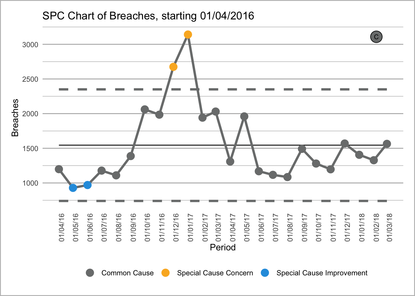
NHS-R Community’s plot-the-dots package
The NHSR Plot the Dots package is built by the NHS-R community to provide tools for drawing statistical process control (SPC) charts. The package supports the NHS England programme ‘Making Data Count’. The programme encourages boards, managers, and analyst teams to present data in ways that show change over time, and drive better understanding of indicators than ‘RAG’ (red, amber, green) rated reports often present.
# install from CRAN
install.packages("NHSRplotthedots")
install.packages("rmarkdown")

# Or install the development version from GitHub using {remotes} package:
# install.packages("remotes")
remotes::install_github("https://github.com/nhs-r-community/NHSRplotthedots", build_vignettes = TRUE)
The help-files, and vignette within this package tell you more about the possible options for controlling the charts
Below is an example of the type of chart the package produces. The plot uses the ae_attendances dataset from the {NHSRdatasets} package and a bit of {dplyr} code to select some organisations.
library(NHSRplotthedots)
library(NHSRdatasets)
library(tidyverse)
df <- ae_attendances %>%
filter(org_code == "RQM", type == 1, period < as.Date("2018-04-01"))
df %>%
ptd_spc(value_field = breaches, date_field = period, improvement_direction = "decrease")